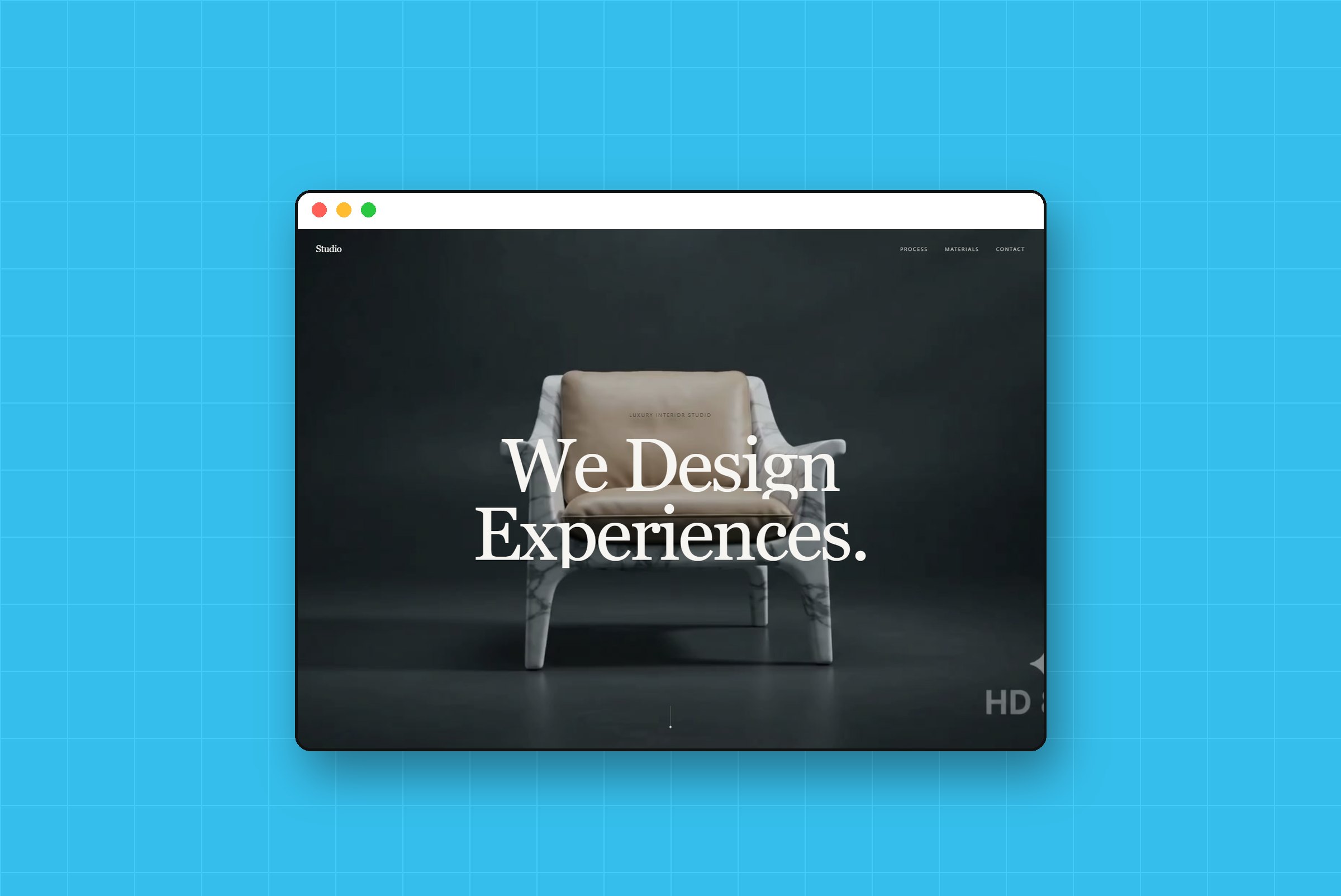
Luxury Interior 3D
A showroom you walk through just by scrolling.
3D & Motion
React
Role
Creative Developer
Timeline
2-day build
team
Me + 8 videos
platform
Web (React)
The Real Problem
A luxury interior studio doesn't sell furniture. It sells a feeling: the moment you step into a room and everything just fits. Their old way of showing that was a grid of photos, and a grid of photos feels like a catalogue.
The brief was to make the website feel like a walk through a finished home. Living room, kitchen, bedroom, the materials, the plans, and then the invitation to talk.
The question underneath it all:
'Can a website feel like a showroom, not a brochure?'
'Can we show how a room comes together, not just the end result?'
'Can it stay smooth on a normal laptop?'
Finding the Fix
I built it as a standalone React app with Vite, Tailwind, GSAP ScrollTrigger and Lenis for smooth scrolling, with Three.js for the 3D moments.
The key insight was about the videos. Normal video files only store a full picture every few seconds, so jumping to any frame while scrolling means the browser has to rebuild it from scratch. That is where the stutter comes from.
Every frame a keyframe. I re-encoded all eight videos so each frame is complete on its own. Scrolling now just picks a frame, it never has to rebuild one.
Timing read from the footage. I didn't guess when things happen on screen. I watched the footage and measured: the bed finishes assembling at 80% of its clip, so the text arrives right then.
One timeline. Hero, Living Room, Kitchen, Bedroom, Materials, Blueprint, Finale and Contact all run on a single scroll timeline, so the story never jumps.
What Actually Happened
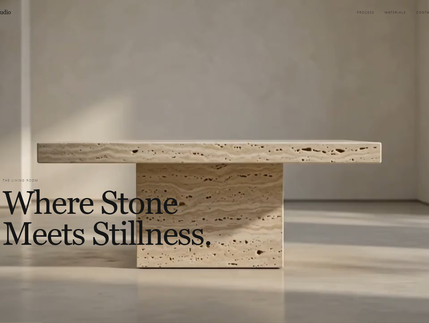
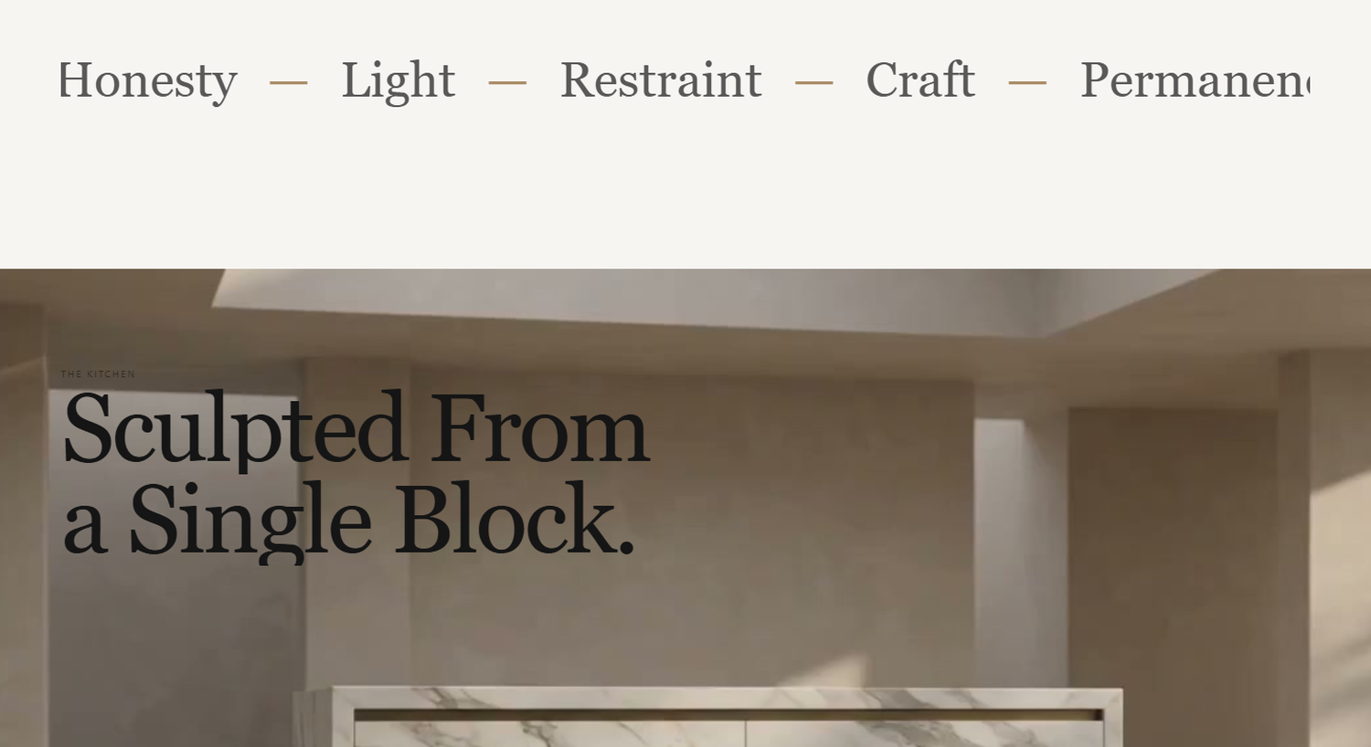
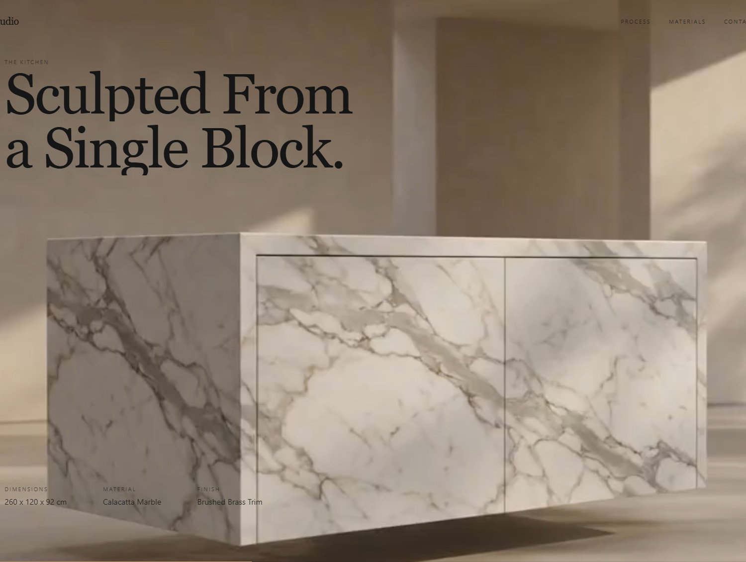
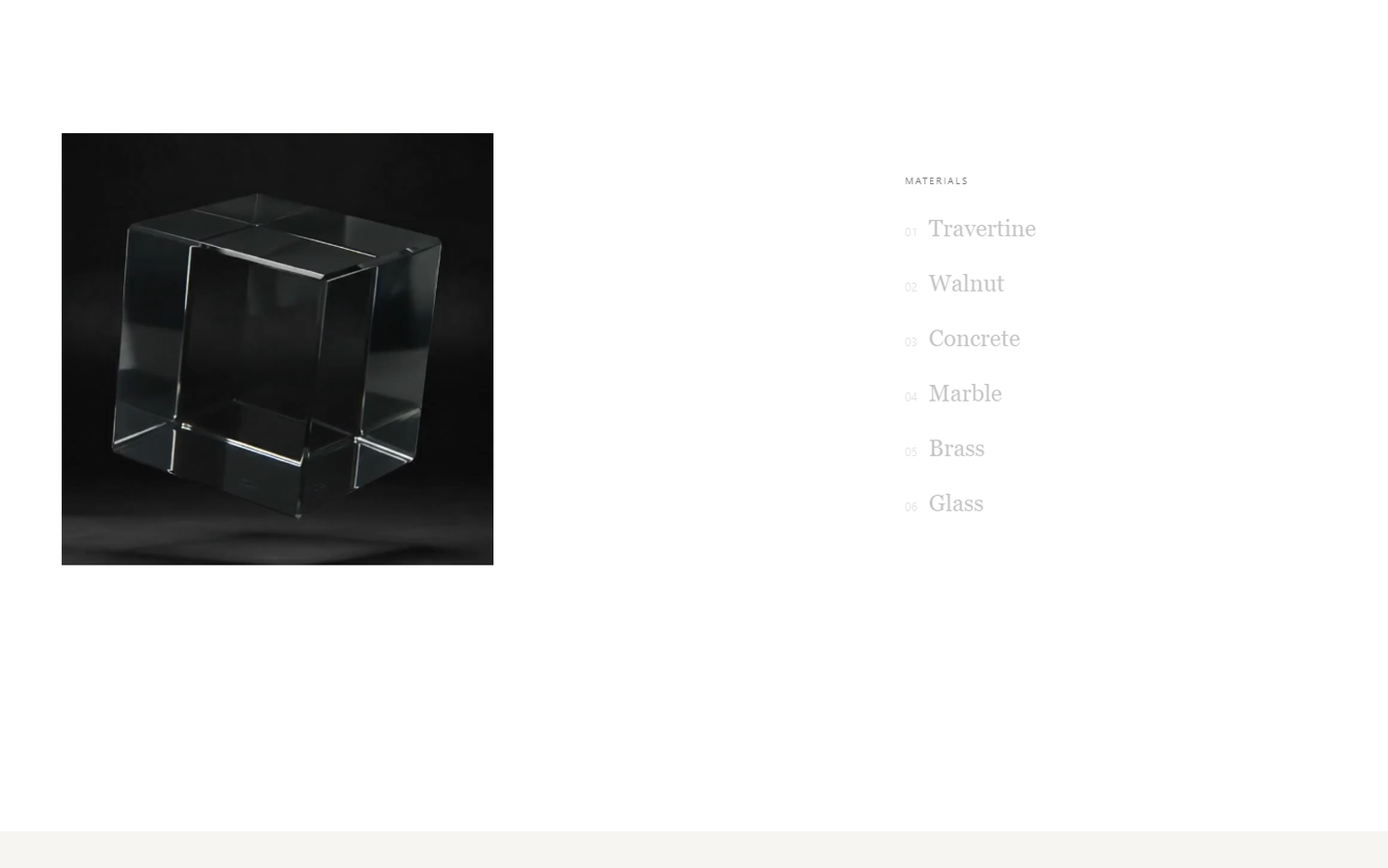
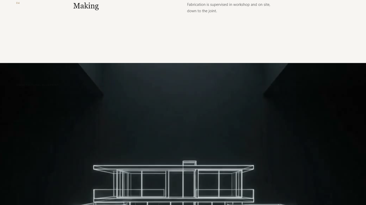
Scroll down and the living room builds itself around you. Keep going and the kitchen slides into place, then the bedroom. The materials section turns a cube to show each finish, and the blueprint draws itself line by line before the finale opens up.
Testing in a real headless browser caught one bug a screenshot never would have: at the very bottom of the page, the contact heading slid under the fixed navigation, because the section was taller than the screen. I fixed the layout so the last section always fits the viewport.
What Changed
The whole site, all eight scenes, was built and verified in two days.
0 console errors in a real browser run.
A clean production build.
Smooth scrubbing, because the video files were built for it.
More importantly, the site does what a photo grid can't. It shows the process, and in interior design the process is the thing people are paying for.
What I Had to Work With
Eight product videos. Each scene came as an AI-generated video: a room assembling itself, a material cube turning, a blueprint drawing in.
One continuous story. No page loads, no carousels. Everything had to live on one long scroll.
A real deadline. The build had to be ready in days, not weeks.
Performance on real machines. Scroll-driven video is famous for stuttering, and a stuttering luxury site is worse than no site at all.
What I'd Do Differently
I'd plan the video encoding before the first line of code. I learned the keyframe lesson halfway through, and it would have saved an afternoon of chasing a stutter that was never in my code.
What I Learned
Motion should explain, not decorate. Every animation on this site shows something real: how a room is assembled, what a surface feels like, how the plan becomes a home.
Measure, don't guess. Reading the timing straight from the footage is why the text lands exactly when the scene does.